1. LinearLayout 개념
2. TextView, ImageView, ScrollView, EditText, Button의 기본적인 사용방법
3. ClickListner 설정 방법
4. Data binding 개념
5. ConstraintLayout개념
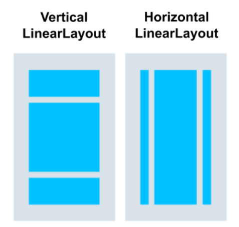
LinearLayout
LinearLayout은 뷰그룹으로 다른 뷰나 뷰그룹을 포함할 수 있다.
LinearLayout은 뷰들이 차례대로 배치되는 레이아웃으로 수평(horizontal)또는 수직(vertical)방향으로 설정할 수 있다.
<LinearLayout
       xmlns:android="http://schemas.android.com/apk/res/android"
       xmlns:tools="http://schemas.android.com/tools"
       xmlns:app="http://schemas.android.com/apk/res-auto"
       android:layout_width="match_parent"
       android:layout_height="match_parent"
       android:orientation="vertical"
       tools:context=".MainActivity">

</LinearLayout>
xml코드로는 위와 같이 작성하며, layout\_width, layout\_height, orientation은 필수요소이다.
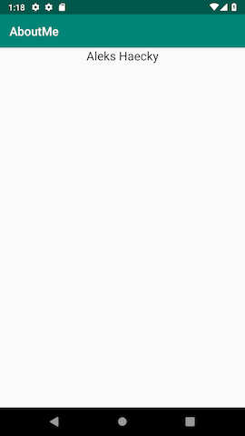
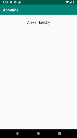
TextView
이제 LinearLayout안에 TextView를 추가해 보자.
텍스트뷰는 Design탭 이나 Text(Code)탭에서 추가 할 수 있다.
<!-- activity_main.xml -->

<TextView
        android:id="@+id/name_text"
                android:textSize="@dimen/text_size"
        android:layout_width="match_parent"
        android:layout_height="wrap_content"
        android:text="@string/name"
        android:textAlignment="center" />

<!-- dimens.xml -->
<resources>
    <dimen name="text_size">20sp</dimen>
</resources>

<!-- string.xml -->
<resources>
    <string name="app_name">AboutMe</string>
</resource>
텍스트뷰에 textSize 를 사용할 때 크기는 sp지정해주어야 해상도의 영향을 덜 받는다. 그리고 사이즈의 경우 dimens.xml에 값을 저장해두고 사용하는 것이 권장된다.
또 text옵션을 설정할 때도 string.xml에 저장해두고 사용하는 것을 권장한다.
Style
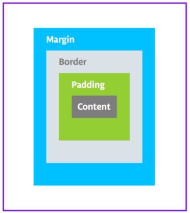
뷰에는 padding이랑 margin이라는 속성이 있다.
padding은 뷰의 경계선에서 뷰의 내용물사이에 공백을 생성하는 것이다.
margin은 뷰의 경계선과 다른 뷰 또는 부모 뷰,뷰그룹과의 공백을 만드는 것이다.
padding
android:paddingandroid:paddingTopandroid:paddingBottomandroid:paddingStartandroid:paddingEndandroid:paddingLeftandroid:paddingRight
위의 속성들로 padding을 설정할 수 있다.
margin
android:layout_marginandroid:layout_marginTopandroid:layout_marginBottomandroid:layout_marginStartandroid:layout_marginEndandroid:layout_marginLeftandroid:layout_marginRight
위의 속성들로 margin을 설정할 수 있다.
left, right는 화면의 왼쪽, 오른쪽을 나타내는 것이고, start, end는 언어에 따라 글자가 시작하는 방향을 기준으로 하는 것이다.
res/values/styles.xml 파일에 style을 설정해서 사용할 수도 있다.
style속성의 item으로는 layout_width, layout_height, margin, fontFamily, padding, textAlignment, textColor, textSize 등을 설정할 수 있다.
<!-- styles.xml -->
<style name="NameStyle">
   <item name="android:layout_marginTop">@dimen/layout_margin</item>
   <item name="android:fontFamily">@font/roboto</item>
   <item name="android:paddingTop">@dimen/small_padding</item>
   <item name="android:textColor">@android:color/black</item>
   <item name="android:textSize">@dimen/text_size</item>
</style>
텍스트뷰에 style="@style/NameStyle"를 추가해서 사용할 수 있다.
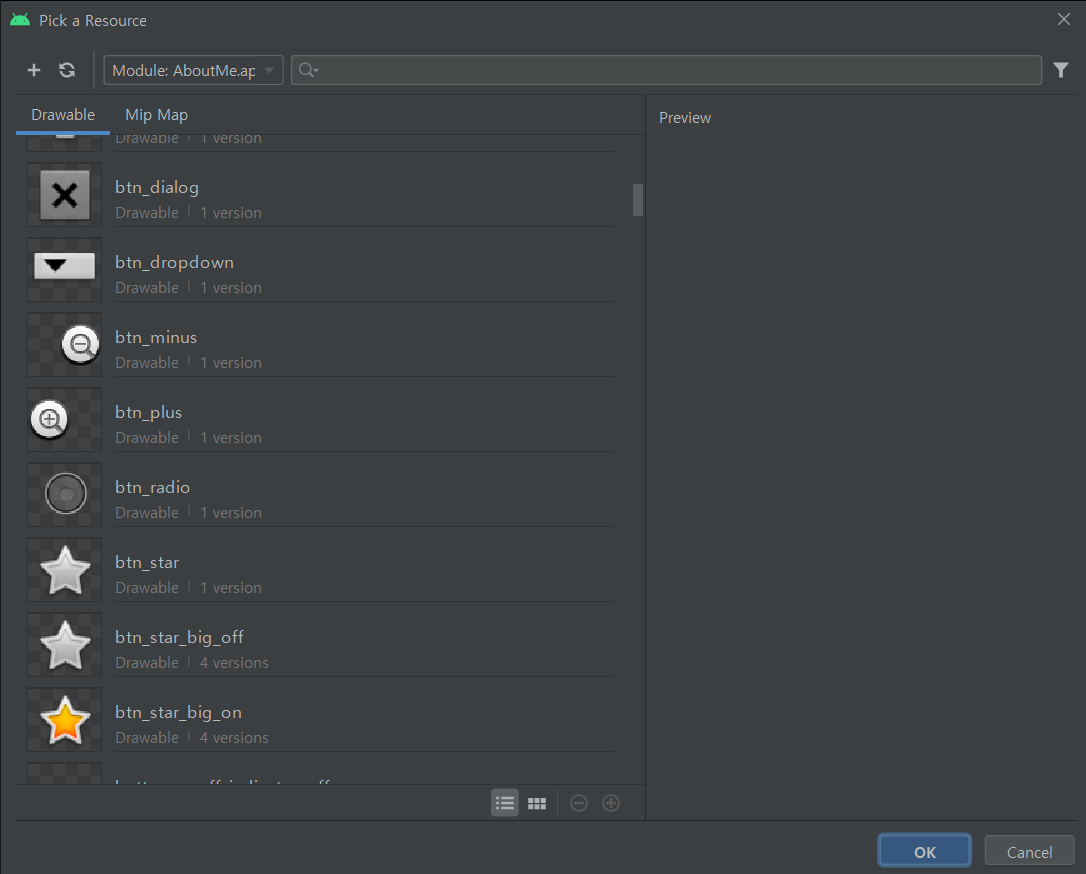
ImageView
이미지 뷰는 이미지를 보여주는 뷰이다. 이미지 뷰는 png, jpg, gif, WebP와 같은 Bitmap 이나 vector drawing같은 Drawable자료를 보여줄 수 있다.
xml의 Design 페이지에서 Image View를 추가하면, 안드로이드가 기본으로 제공하는 이미지들을 사용할 수 있다.
<ImageView
   android:id="@+id/imageView"
   android:layout_width="match_parent"
   android:layout_height="wrap_content"
   app:srcCompat="@android:drawable/btn_star_big_on" />
코드로 작성하면 다음과 같다.
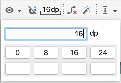
뷰의 마진을 설정할 때에도 dimens.xml파일에 값을 저장해두고 사용하는 것이 권장된다.
<dimen name="layout_margin">16dp</dimen>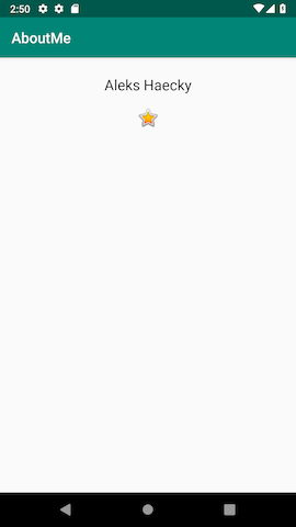
ScrollView
스크롤 뷰는 화면 크기를 넘어가는 뷰를 스크롤해서 볼 수 있게 해주는 뷰그룹이다.
스크롤 뷰는 오직 하나의 뷰, 뷰그룹을 포함할 수 있다. 보통 LinearLayout을 자식 뷰로 사용하여 LinearLayout안에 다른 뷰들을 넣는다.
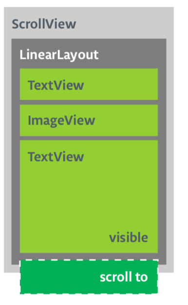
스크롤 뷰는 Design탭에서 추가하거나, 아래와 같은 코드로 추가할 수도 있다.
<ScrollView
   android:layout_width="match_parent"
   android:layout_height="match_parent">

   <LinearLayout
       android:layout_width="match_parent"
       android:layout_height="wrap_content"
       android:orientation="vertical" />
</ScrollView>
스크롤 뷰에 텍스트를 추가해보자.
<!-- string.xml -->
<string name="bio">Hi, my name is Aleks.
\n\nI love fish.
\n\nThe kind that is alive and swims around in an aquarium or river, or a lake, and definitely the ocean.
\nFun fact is that I have several aquariums and also a river.
\n\nI like eating fish, too. Raw fish. Grilled fish. Smoked fish. Poached fish - not so much.
\nAnd sometimes I even go fishing.
\nAnd even less sometimes, I actually catch something.
\n\nOnce, when I was camping in Canada, and very hungry, I even caught a large salmon with my hands.
\n\nI\'ll be happy to teach you how to make your own aquarium.
\nYou should ask someone else about fishing, though.\n\n</string>string.xml에 장문의 텍스트를 추가하고, 텍스트 뷰의 text속성으로 지정해주자.
lineSpacingMultiplier속성으로 줄간격을 설정할 수 있다.
<ScrollView
        android:id="@+id/bio_scroll"
        android:layout_width="match_parent"
        android:layout_height="match_parent">

        <TextView
            android:id="@+id/bio_text"
            style="@style/NameStyle"
            android:layout_width="match_parent"
            android:layout_height="wrap_content"
            android:lineSpacingMultiplier="1.2"
            android:text="@string/bio" />
    </ScrollView>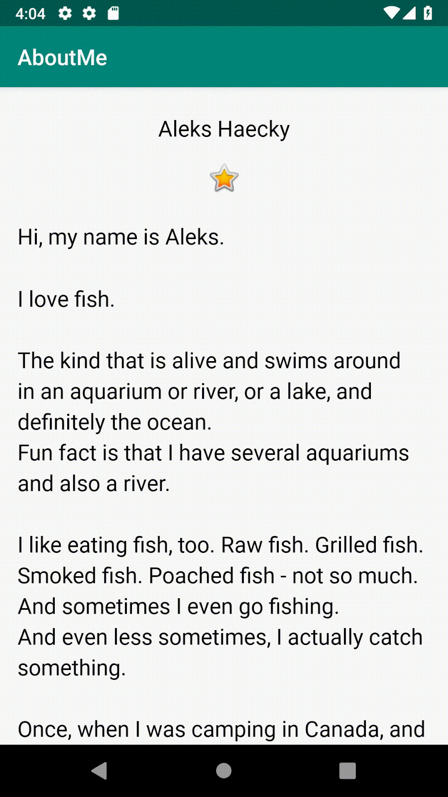
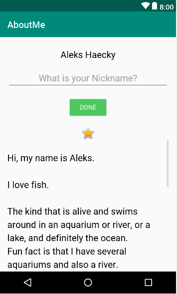
EditText
EditText는 텍스트 입력을 받을 수 있는 뷰이다. TextView의 자식클래스이다.
Design탭의 text에서 plain text를 사용하거나 xml태그 <EditText/> 로 사용할 수 있다.
<!-- string.xml -->
<string name="what_is_your_nickname">What is your Nickname?</string>

<!-- activity_main.xml -->
<EditText
        android:id="@+id/nickname_edit"
        style="@style/NameStyle"
        android:layout_width="match_parent"
        android:layout_height="wrap_content"
        android:ems="10"
        android:hint="@string/what_is_your_nickname"
        android:inputType="textPersonName"
        android:textAlignment="center" />
위와 같이 사용할 수 있다.
hint속성은 EditText에 입력해야되는 텍스트에 대한 정보를 알려주는 속성이다.
hint의 내용도 string.xml에 저장해서 사용하는 것이 권장된다.
inputType 속성의 값으로는 textPersonName, textPassword, textEmailAddress, number 등을 설정할 수 있다.
inputType는 텍스트의 표시방법과 키보드 방식에 영향을 준다.
Button
Button도 TextView의 자식클래스로 텍스트를 지정하고, 클릭이벤트를 받을 수 있다.
<Button
   android:id="@+id/done_button"
   style="@style/Widget.AppCompat.Button.Colored"
   android:layout_width="wrap_content"
   android:layout_height="wrap_content"
   android:layout_gravity="center_horizontal"
   android:layout_marginTop="@dimen/layout_margin"
   android:fontFamily="@font/roboto"
   android:text="@string/done" />

<!-- colors.xml -->
<resources>
   <color name="colorPrimary">#008577</color>
   <color name="colorPrimaryDark">#00574B</color>
   <color name="colorAccent">#D81B60</color>
</resources>
색 정보는 res/values/colors.xml 파일에 저장해두고 사용할 수 있다.
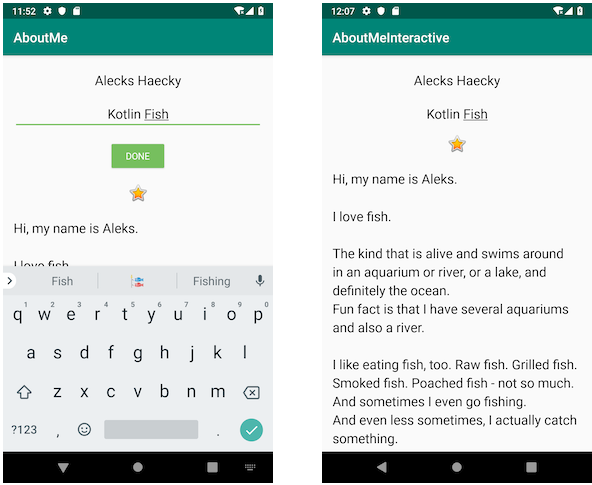
Click Listener
버튼에 클릭 리스너를 지정하려면, xml코드 상에서 android:onClick="METHODNAME" 속성을 추가하고, 코틀린 코드에서 METHODNAME메소드를 정의해서 사용하는 방법과, 또는 코틀린 코드에서 findviewbyid로 버튼의 id값을 가져와서, setOnClickListener로 클릭 리스너를 설정하는 방법이 있다.
override fun onCreate(savedInstanceState: Bundle?) {
        super.onCreate(savedInstanceState)
        setContentView(R.layout.activity_main)

        findViewById<Button>(R.id.done_button).setOnClickListener {
            addNickname(it)
        }
    }

private fun addNickname(view: View) {
        val editText = findViewById<EditText>(R.id.nickname_edit)
        val nicknameTextView = findViewById<TextView>(R.id.nickname_text)

        nicknameTextView.text = editText.text
        editText.visibility = View.GONE
        view.visibility = View.GONE
        nicknameTextView.visibility = View.VISIBLE

        // Hide the keyboard.
        val imm = getSystemService(Context.INPUT_METHOD_SERVICE) as InputMethodManager
        imm.hideSoftInputFromWindow(view.windowToken, 0)

}it은 done_button 을 말한다.
EditText에 텍스트를 입력하고 버튼을 누르면 nickNameTextView에 텍스트 값을 저장한다. 그 뒤 view로 지정된 버튼과 editText를 .visibility=View.GONE를 이용해 뷰를 사라지게 하고,
nicknameTextView.visibility = View.VISIBLE 로 뷰를 보이게 만들어 아래의 사진과 같이 만들어 준다.
override fun onCreate(savedInstanceState: Bundle?) {
        super.onCreate(savedInstanceState)
        setContentView(R.layout.activity_main)

                // ...

        findViewById<TextView>(R.id.nickname_text).setOnClickListener {
            updateNickname(it)
        }
    }
private fun updateNickname(view: View) {
        val editText = findViewById<EditText>(R.id.nickname_edit)
        val doneButton = findViewById<Button>(R.id.done_button)

        editText.visibility = View.VISIBLE
        doneButton.visibility = View.VISIBLE
        view.visibility = View.GONE

        // Set the focus to the edit text.
        editText.requestFocus()

        // Show the keyboard.
        val imm = getSystemService(Context.INPUT_METHOD_SERVICE) as InputMethodManager
        imm.showSoftInput(editText, 0)
    }
또 TextView에도 클릭 리스너를 설정할 수 있다. 위에서 텍스트뷰 영역을 클릭하면, editText와 button을 보이게하고, textView를 보이지 않게 한 후, editText에 포커스를 주고 키보드를 보이게 한다.
Data binding
data binding 라이브러리를 사용하여, 비효율적인 findViewById() 호출을 제거한다. 그리고 XML에서 앱 데이터에 직접 접근한다.
findViewById()는 사용할 때마다 뷰를 찾기 때문에 프로그램의 규모가 커지고 뷰가 많아지게되면 비효율적이다.
data binding 기술을 사용하면 이를 해결할 수 있다. binding object를 앱에 만들면 이 객체를 통해 뷰들과 데이터에 접근할 수 있다.
데이터 바인딩을 사용하면 다음의 장점이 있다.
- 코드가 짧고, 쉬워진다.
findViewById보다 코드를 관리하기도 쉬워진다. - 데이터와 뷰가 완전히 분리된다.
- 앱이 시작될 때 한번만, 뷰의 계층구조를 읽는다.
- 접근하는 뷰에 타입 안정성을 갖는다.
데이터 바인딩을 사용하려면 build.gradle(Module: app)파일의 android섹션에 다음과 같이 추가한다.
buildFeatures {
    dataBinding true
}
다음으로 XML 레이아웃파일을 <layout>태그로 감싸줘야한다.
가장 외부의 태그인 <LinearLayout>을 감싸준다.
<layout xmlns:android="http://schemas.android.com/apk/res/android"
   xmlns:app="http://schemas.android.com/apk/res-auto">
    <LinearLayout ... >
   		...
    </LinearLayout>
</layout>
다음으로 MainActivity의 전역변수로 binding타입의 변수를 선언한다.
private lateinit var binding: ActivityMainBinding이름은 activity_main + Binding의 형태이다.
그리고 onCreate()메소드에 setContentView()부분을 다음과 같이 바꾼다.
binding = DataBindingUtil.setContentView(this, R.layout.activity_main)이제 findViewById()부분을 binding객체로 바꿀 수 있다.
binding 객체가 생성될 때, 컴파일러가 뷰의 이름을 레이아웃의 뷰의 id로부터 binding 객체에 만든다. camel case(done_button → doneButton)로 변환된다.
binding.nicknameText.text = binding.nicknameEdit.text.toString()
binding.nicknameEdit.visibility = View.GONE
binding.doneButton.visibility = View.GONE
binding.nicknameText.visibility = View.VISIBLE
//----------------------------------------------
binding.apply {
   nicknameText.text = nicknameEdit.text.toString()
   nicknameEdit.visibility = View.GONE
   doneButton.visibility = View.GONE
   nicknameText.visibility = View.VISIBLE
}
위와 같이 binding.NAME해서 쓰거나, apply{}를 사용할 수도 있다.
binding.nicknameEdit.text는 Editable타입이기 때문에 String 으로 형변환 해주었다.
Data Class
data binding을 사용하면 data class를 뷰가 직접 사용할 수 있다.
데이터 클래스는 변수로만 된 클래스를 간단하게 생성하는 것으로
data class Person(var name: String, var age: Int, var gender: String)이런 식으로 정의하면, 생성자, getter/setter와 equals, hashCode, toString같은 canonical 메소드들도 자동으로 생성해준다.
MyName.kt파일을 새로 만들고 데이터 클래스를 정의한다.
data class MyName(var name: String="", var nickname: String="")그리고 activity_main.xml의 과 사이에 태그를 추가한다.
그리고 태그 안에 태그를 추가하고 name, type속성을 추가한다.
<layout ...>
    <data>
        <variable
            name="myName"
            type="com.example.aboutme.MyName"/>
    </data>
        <LinearLayout ...>
name속성은 data class의 참조변수처럼 쓰인다. type속성은 data class인 MyName클래스의 패키지 경로를 지정한다.
android:text="@string/name"
//====>
android:text="@={myName.name}"
이렇게 사용할 수 있다.
그 다음 MainActivity.kt에서 데이터 클래스 인스턴스를 만들고 바인딩 객체에 대입한다.
// 전역변수
private val myName: MyName = MyName("Yoon Choi")

// onCreate()
binding.myName = myName
이렇게 데이터를 만들어 뷰에 보이게 할 수 있다.
Constraint Layout
constraint layout은 뷰들간의 관계를 통해 레이아웃을 설정한다.
Design Tab
xml의 디자인 탭에서 Autoconnect와 default margin등을 설정할 수 있다.
뷰를 선택하고 Attributes pane을 보면 위와 같이 constraint bais와 margin을 설정할 수 있고, 네모박스 안의 화살표를 눌러 constraint 속성을 지정할 수 있다.
>>>이 표시는 Wrap content로 뷰의 내용만큼만 뷰를 설정하는 것이다.|---|이 표시는 Fixed로 특정값을 지정해 사용하는 것이다.|-\|\-|이 표시는 Match Constraints로 가능한 만큼 뷰를 확장하는 것이다.
TextView Style
add font
폰트 추가는 Attributes pane의 fontFamilly 속성에서 More Fonts를 선택하면 원하는 폰트를 추가할 수 있다.
add style
뷰에 style속성을 추가해서, font, size, color, background등을 설정할 수 있다.
<!-- res/values/string.xml -->
<string name="box_one">Box One</string>

<!-- res/values/dimens.xml -->
<dimen name="margin_wide">16dp</dimen>
<dimen name="box_text_size">24sp</dimen>

<!-- res/values/styles.xml -->
<style name="whiteBox">
    <item name="android:background">@android:color/white</item>
    <item name="android:textAlignment">center</item>
    <item name="android:textSize">@dimen/box_text_size</item>
    <item name="android:textStyle">bold</item>
    <item name="android:textColor">@android:color/white</item>
    <item name="android:fontFamily">@font/roboto</item>
</style>
위와 같이 styles.xml을 만들 수 있다.
이제 TextView에 적용하면
<TextView
    android:id="@+id/box_one_text"
    style="@style/whiteBox"
    android:layout_width="0dp"
    android:layout_height="wrap_content"
    android:layout_marginStart="@dimen/margin_wide"
    android:layout_marginTop="@dimen/margin_wide"
    android:layout_marginEnd="@dimen/margin_wide"
    android:text="@string/box_one"
    app:layout_constraintLeft_toLeftOf="parent"
    app:layout_constraintRight_toRightOf="parent"
    app:layout_constraintTop_toTopOf="parent" />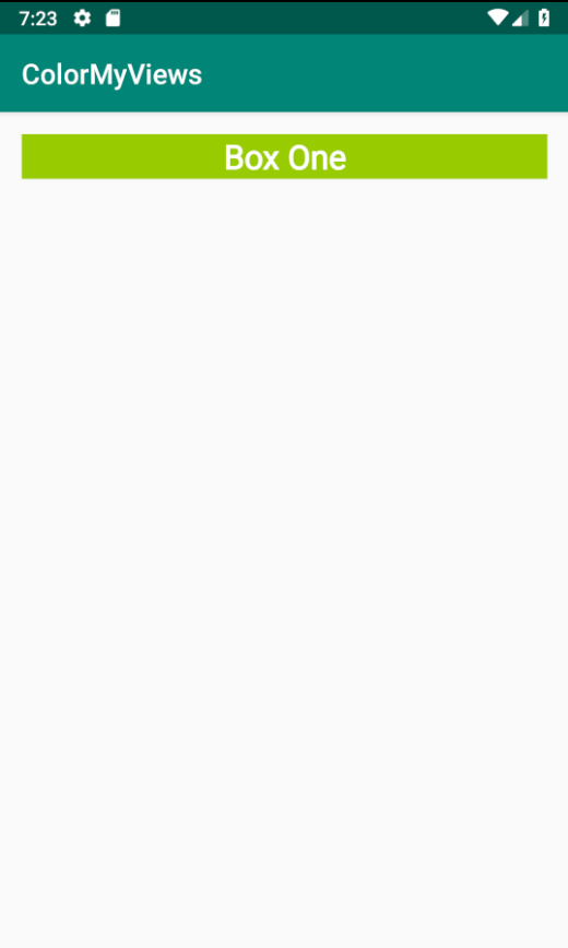
이런 화면이 된다. font와 color등의 속성은 style로 지정하였기 때문에 지워도 된다.
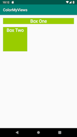
Add second TextView
새로운 텍스트뷰를 추가하면, 새로운 관계를 추가해야한다. 최소한 가로, 세로 1개씩의 관계를 만들어야한다.
디자인 탭에서 작업하는 경우, 뷰를 선택하고 다른 뷰나 뷰그룹과 연결지으면 된다.
코드로 보면 app:layout_constraintXXX_toYYYOf="[ID]" 이렇게 id의 YYY에 이 뷰의 XXX를 연결시킨다는 뜻이다. 예를들어 app:layout_constraintTop_toTopOf="parent" 부모의 Top에 이 뷰의 Top을 연결시켰다는 뜻이다.
<TextView
    android:id="@+id/box_two_text"
    style="@style/whiteBox"
    android:layout_width="130dp"
    android:layout_height="130dp"
    android:layout_marginStart="16dp"
    android:layout_marginTop="16dp"
    android:text="@string/box_two"
    app:layout_constraintStart_toStartOf="parent"
    app:layout_constraintTop_toBottomOf="@+id/box_one_text" />
이렇게 새로운 텍스트 뷰를 추가하면 아래와 같은 화면이 나온다.
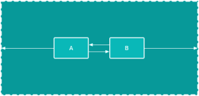
Chain
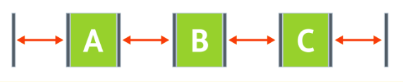
chain은 뷰를 양방향으로 연결하는 것이다.
chain style
체인 스타일은 여러가지가 있다.
-
Spread - 기본 스타일이다. 여백을 계산하여 같은 간격으로 배치된다.
-
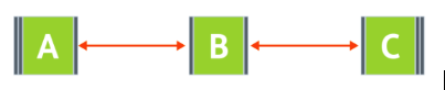
Spread inside - 말단 뷰는 부모 뷰에 붙고, 같은 간격으로 배치된다.
-
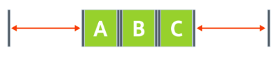
Packed - 뷰들이 함께 묶여있다. bias를 줄 수도 있다.
-
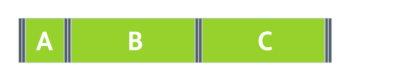
Weighted - 모든 공간을 채우고 weight값에 따라 비율을 나누는 것이다.
layout_constraintHorizontal_weight,layout_constraintVertical_weight속성으로 weight를 부여한다.
chain style은 헤드에 설정한다. horizontal chain에서는 가장 왼쪽 뷰, vertical chain에서는 가장 위쪽 뷰가 head가 된다.
head의 속성으로 다음과 같이 추가하면 된다.
// Horizontal spread chain
app:layout_constraintHorizontal_chainStyle="spread"

// Vertical spread inside chain
app:layout_constraintVertical_chainStyle="spread_inside"

// Horizontal packed chain
app:layout_constraintHorizontal_chainStyle="packed"
체인을 만들기 위해 Box One과 Box Two사이에 텍스트뷰 3개를 추가하자. 각각 스타일을 설정해준다.
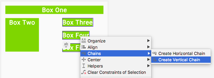
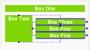
3개의 텍스트뷰를 선택한 뒤, 우클릭/Chains/Create Vertical Chain을 선택하면 체인이 만들어진다.
만들어진 체인의
-
Box Three의 Top을 Box Two의 Top에 연결하고,
-
Box Five의 Bottom을 Box Two의 Bottom에 연결하고,
-
Box Three, Box Four, Box Five의 Left를 Box Two의 Right에 연결하고,
-
Box Three, Box Four, Box Five의 Right를 parent에 연결하고,
-
width를 0으로 주면 아래와 같은 화면이 만들어진다.
<TextView
android:id="@+id/box_three_text"
style="@style/whiteBox"
android:layout_width="0dp"
android:layout_height="wrap_content"
android:layout_marginStart="@dimen/margin_wide"
android:layout_marginEnd="@dimen/margin_wide"
android:text="@string/box_three"
app:layout_constraintBottom_toTopOf="@+id/box_four_text"
app:layout_constraintEnd_toEndOf="parent"
app:layout_constraintStart_toEndOf="@+id/box_two_text"
app:layout_constraintTop_toTopOf="@+id/box_two_text" />
<TextView
android:id="@+id/box_four_text"
style="@style/whiteBox"
android:layout_width="0dp"
android:layout_height="wrap_content"
android:layout_marginStart="@dimen/margin_wide"
android:layout_marginTop="@dimen/margin_wide"
android:layout_marginEnd="@dimen/margin_wide"
android:layout_marginBottom="@dimen/margin_wide"
android:text="@string/box_four"
app:layout_constraintBottom_toTopOf="@+id/box_five_text"
app:layout_constraintEnd_toEndOf="parent"
app:layout_constraintStart_toEndOf="@+id/box_two_text"
app:layout_constraintTop_toBottomOf="@+id/box_three_text" />
<TextView
android:id="@+id/box_five_text"
style="@style/whiteBox"
android:layout_width="0dp"
android:layout_height="wrap_content"
android:layout_marginStart="@dimen/margin_wide"
android:layout_marginEnd="@dimen/margin_wide"
android:text="@string/box_five"
app:layout_constraintBottom_toBottomOf="@+id/box_two_text"
app:layout_constraintEnd_toEndOf="parent"
app:layout_constraintStart_toEndOf="@+id/box_two_text"
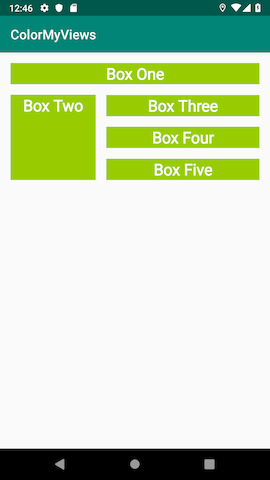
app:layout_constraintTop_toBottomOf="@+id/box_four_text" />각 뷰에 마진을 설정해주면 아래의 화면이 만들어진다.
Click Handlers
각각의 뷰를 흰색으로 만들고, 뷰를 누르면, 각각의 색이 보이도록 만들어보자.
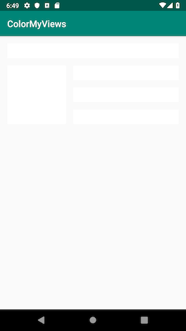
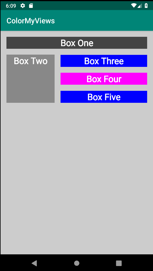
우선 styles.xml/whiteBox에 <item name="android:background">@android:color/white</item> background 색을 흰색으로 바꿔준다.
다음으로 MainActivity.kt에 onCreate() 메소드 뒤에 makeColored()메소드를 추가한다.
private fun makeColored(view: View) {
   when (view.id) {
       R.id.box_one_text -> view.setBackgroundColor(Color.DKGRAY)
       R.id.box_two_text -> view.setBackgroundColor(Color.GRAY)
       R.id.box_three_text -> view.setBackgroundColor(Color.BLUE)
       R.id.box_four_text -> view.setBackgroundColor(Color.MAGENTA)
       R.id.box_five_text -> view.setBackgroundColor(Color.BLUE)
             else -> view.setBackgroundColor(Color.LTGRAY)
   }
}
파라미터는 View로 우리가 클릭하는 텍스트뷰를 파라미터로 받는다.
else의 경우 해당하는 id가 없는 뷰의 색상을 바꾼다. constraints layout에 android:id="@+id/constraint_layout"를 지정해주면, 배경을 눌렀을 때 Color.LTGRAY 색이 된다.
각 뷰에 대해 findViewById와 클릭 리스너를 지정해주기위해 setListeners()메소드를 추가한다.
private fun setListeners() {
    val boxOneText = findViewById<TextView>(R.id.box_one_text)
    val boxTwoText = findViewById<TextView>(R.id.box_two_text)
    val boxThreeText = findViewById<TextView>(R.id.box_three_text)
    val boxFourText = findViewById<TextView>(R.id.box_four_text)
    val boxFiveText = findViewById<TextView>(R.id.box_five_text)
    val rootConstraintLayout = findViewById<View>(R.id.constraint_layout)

    val clickableViews: List<View> =
        listOf(boxOneText, boxTwoText, boxThreeText,
            boxFourText, boxFiveText, rootConstraintLayout)

    for (item in clickableViews) {
        item.setOnClickListener { makeColored(it) }}
}findViewById로 뷰를 받아오고, List를 정의해서 각각의 뷰를 추가하고, for루프를 돌려서 각각의 뷰에 클릭리스너를 지정해준다.
그리고 onCreate()에 끝부분에서 setListeners()를 호출하면 된다.
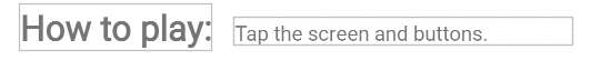
Baseline
baseline은 글자 크기가 다른 뷰 사이에 수평을 맞출 때 도움을 준다.
baseline을 설정하지 않으면, 아래와 같이 부자연스러운 배치를 같는다.

baseline을 설정하면 글자의 중심간의 수평이 맞게 배치된다.
뷰를 선택하고 우클릭/Show Baseline을 선택해서 원하는 뷰와 연결하면 된다.
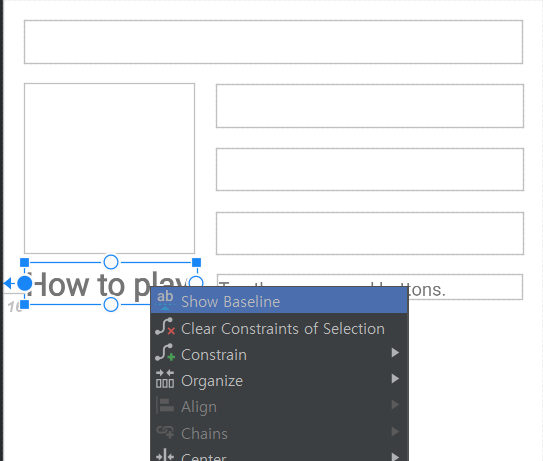
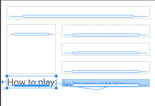
코드로 보면 다음과 같다.
app:layout_constraintBaseline_toBaselineOf="@+id/info_text"'안드로이드' 카테고리의 다른 글
| [android - 1team] Unit3 : Layout (0) | 2021.01.16 |
|---|---|
| [android - 1team] 안드로이드 experince 1 (0) | 2021.01.13 |
| [안드로이드 1팀] Beginner Track Unit 2 : DIsplay a scrollable list (0) | 2020.12.09 |
| [안드로이드 1팀] layouts_get user input in an app (0) | 2020.11.27 |
| [안드로이드 2팀] Build an interactive app (0) | 2020.11.22 |


